
Project Overview
It was my first project I’ve done for Mercedes-Benz’s mobile app, ‘Mercedes Me Connect’, and later renamed ‘Mercedes-Benz’. The goal is to improve the usability of the app’s home screen in both UX and visual design.
My Role
Deliver UI/UX design enhancement concept for Mercedes-Benz mobile app’s home screen.
Context
I was the first in-house designer based in the U.S who took in charge.
Different markets have own versions such as China and EU have different features available due to various regulations and market needs.
Also, the app is an end results of different department’s collaboration. For example, the burger menu is handled by a different teams than the main home screen, which often become a blocker in terms of creating holistic user experience.
Even though there were lots of unknowns, it was my responsibility to know what we don’t know and to ask right questions first to begin with. Also, the team was in need for a new design perspective that could put things together with holistic user experience to go beyond improving and maintaining status quo.
Solutions
Understand the product by testing the prod app
Research - benchmark other OEM apps, find the pain points from internal/external analytics & reports
Collaborate with app teams in different markets (Germany & China) for alignment
Challenges
Understand the product with a short period of time to deliver design concepts
Identifying areas to improve on home screen
Understand design library for the app, how to utilize components correctly
Design process
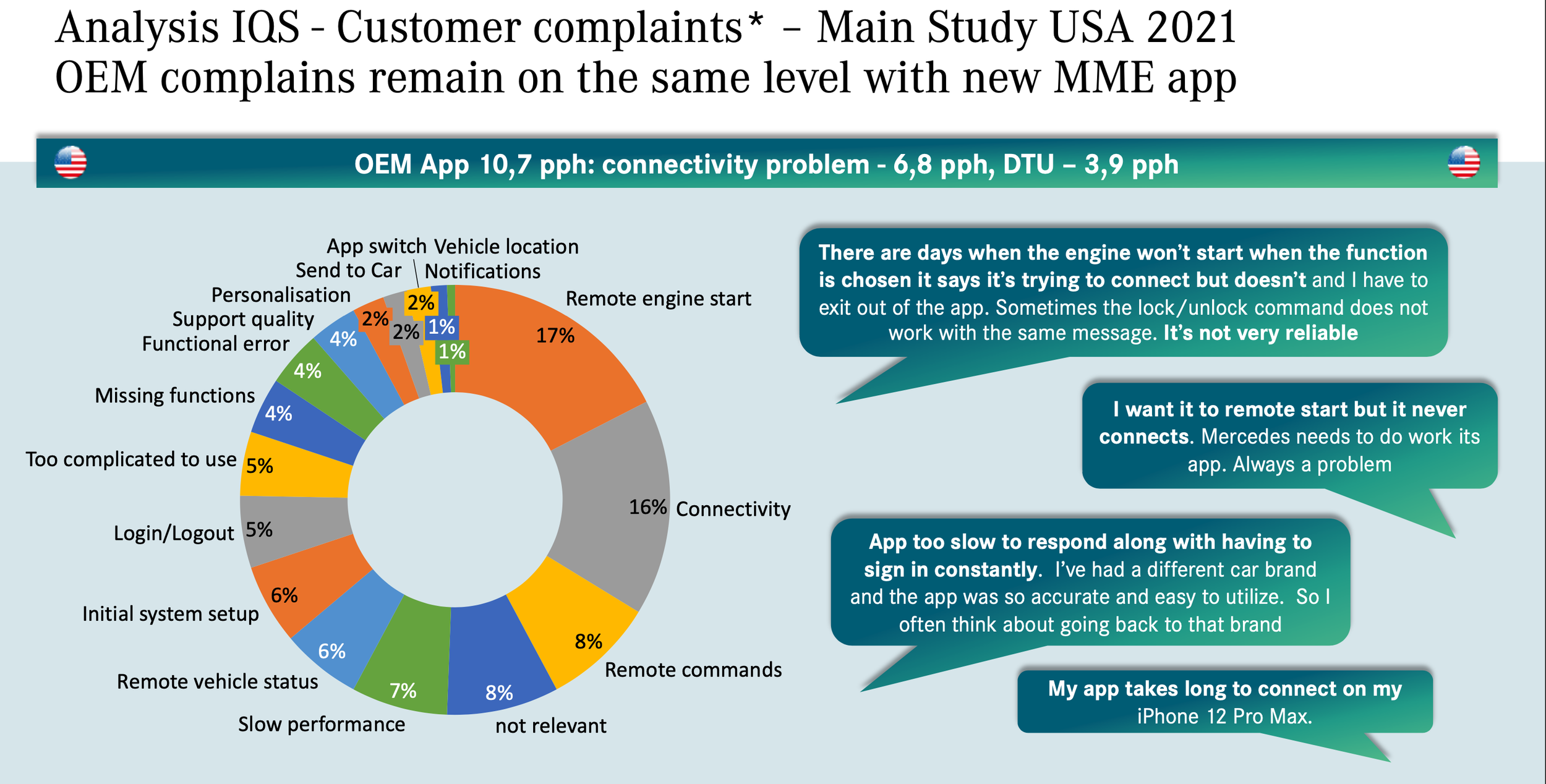
Research - US app Qlick sense data (analytics), US customer market reports. According to QlickSense data (left), the most used features are Remote Engine Start, Door Lock/Unlock features. Also, IQS report (right) shows the remote commands, especially Remote Engine Start constitutes the largest chunk of user issues. Also, the report indicates a significant improvement on the home screen is recommended.
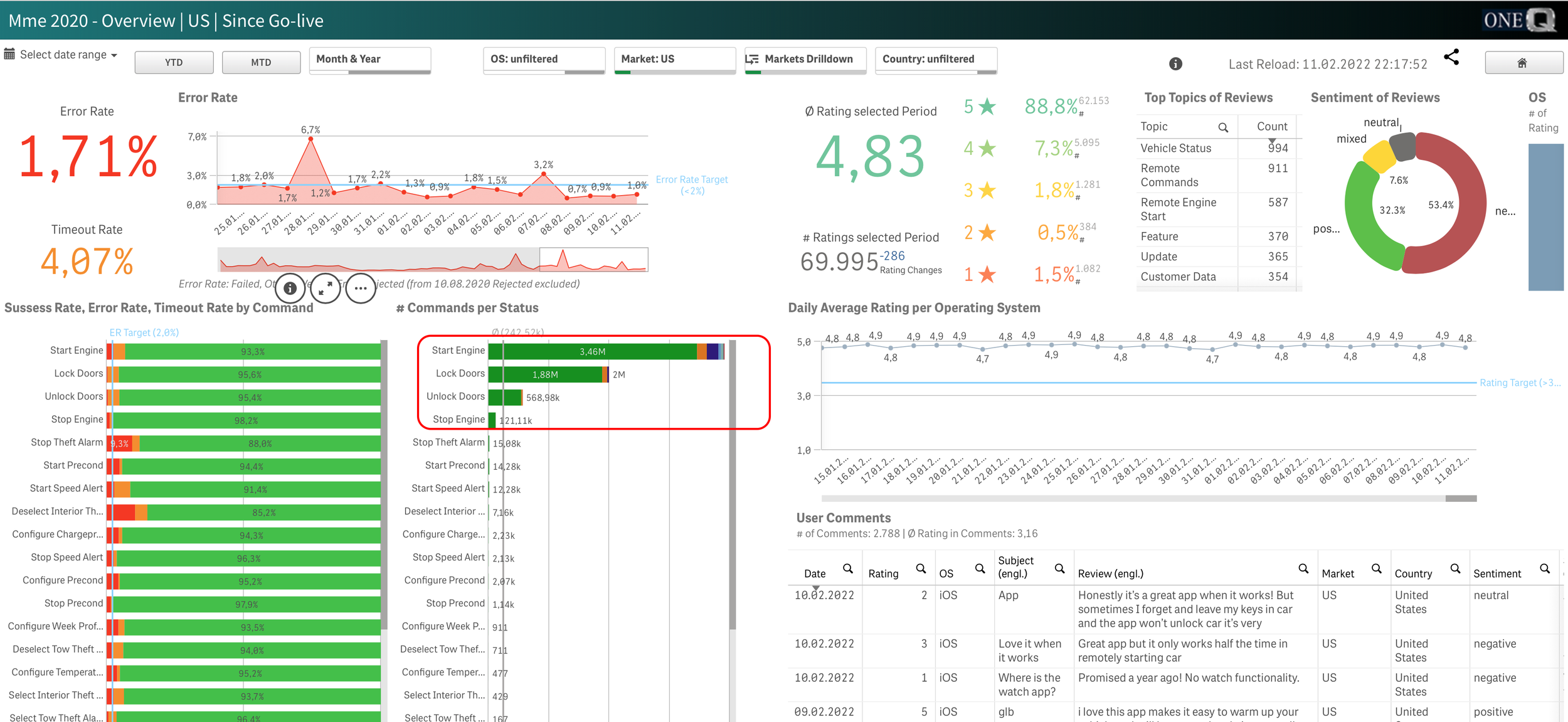
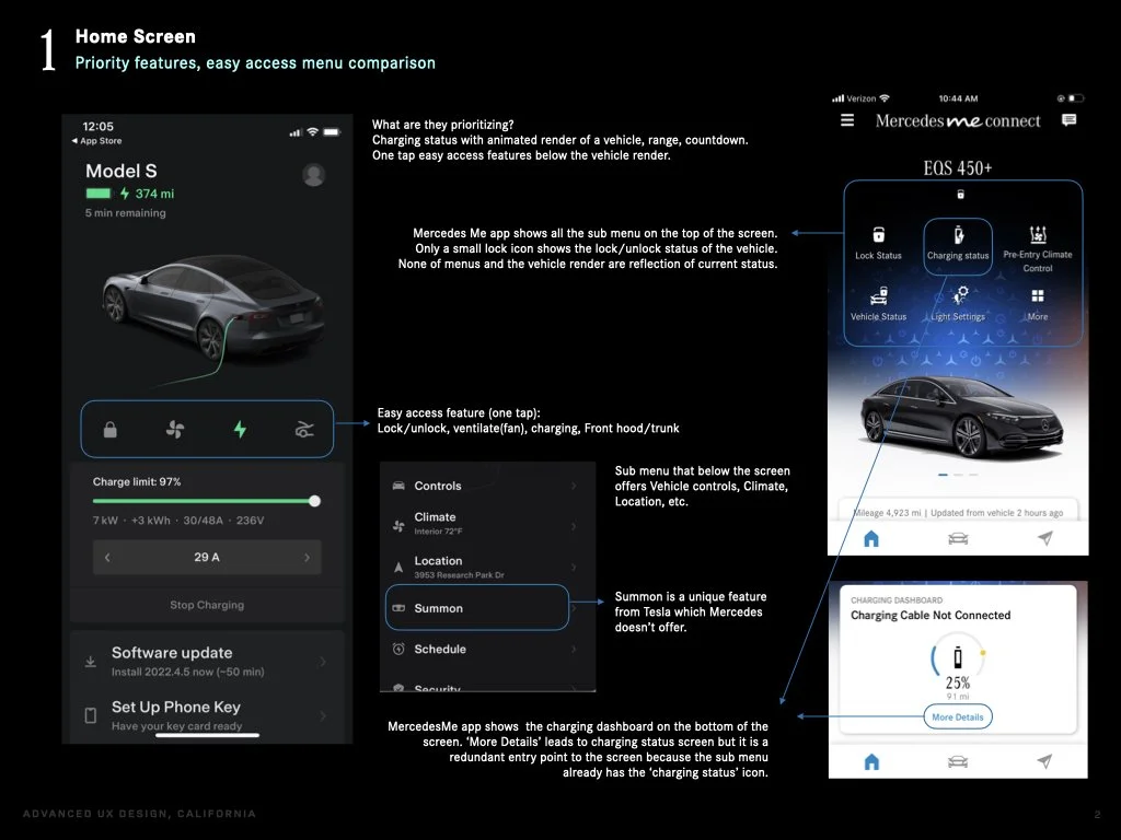
Mostly used features of the app : remote engine start, door lock/unlock.
1-1. Competitor app analysis reports
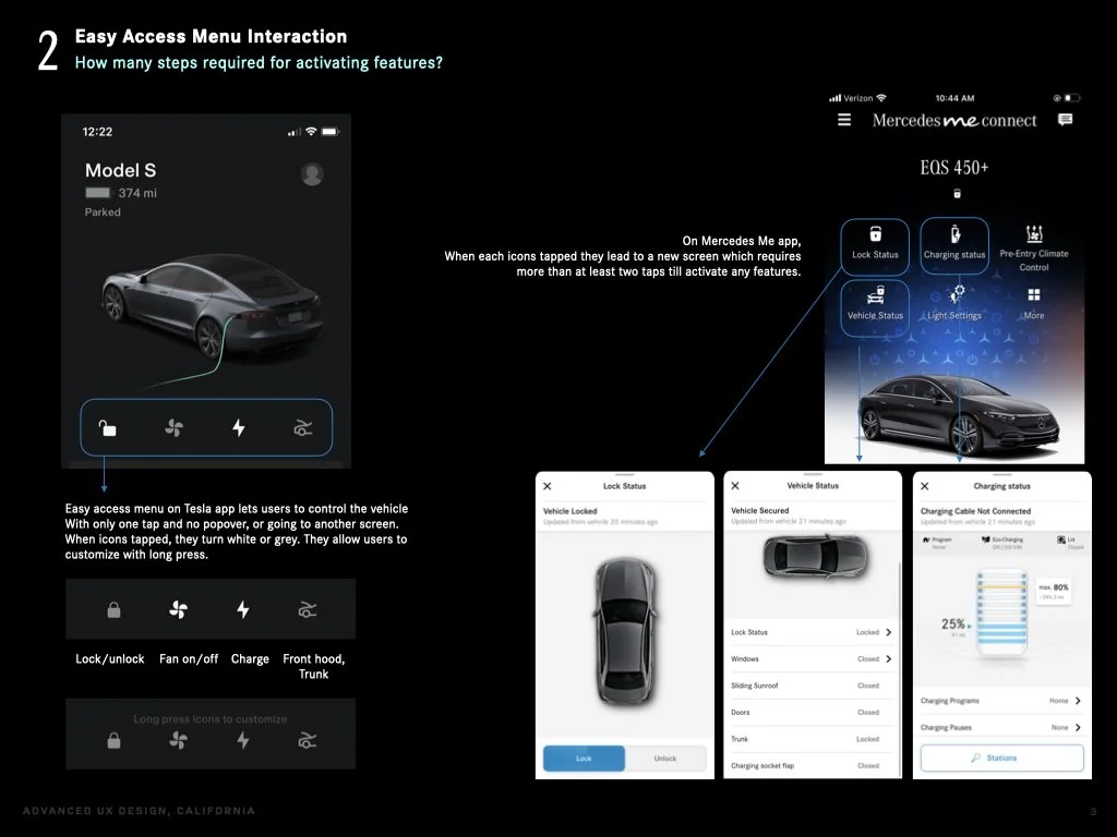

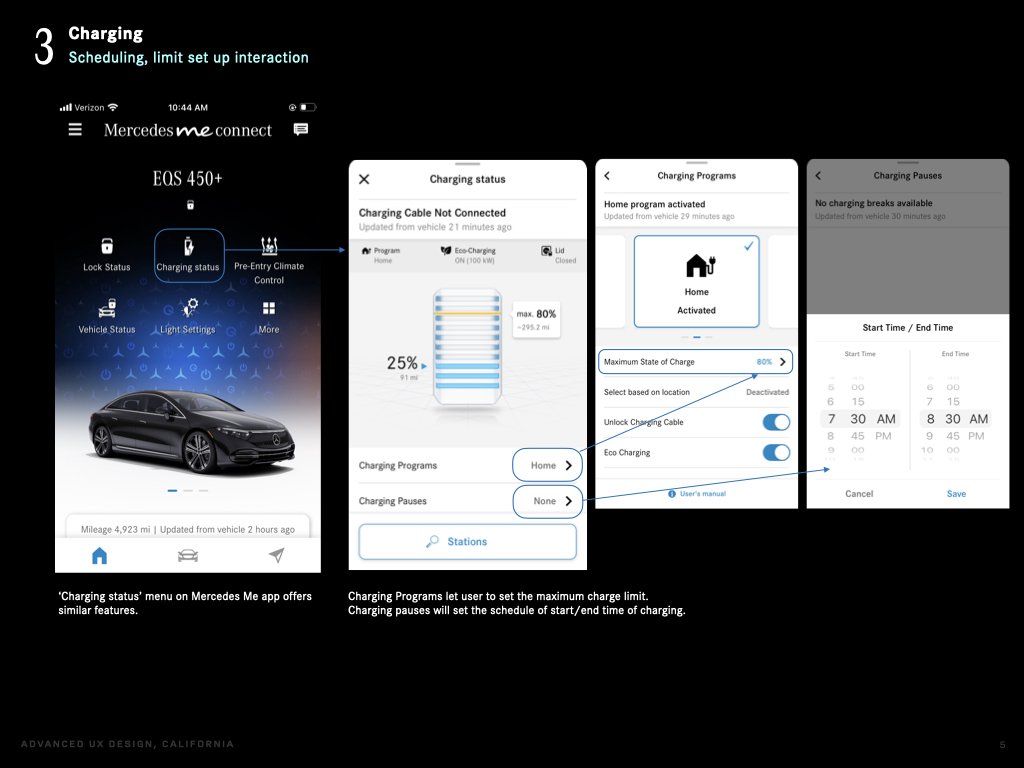
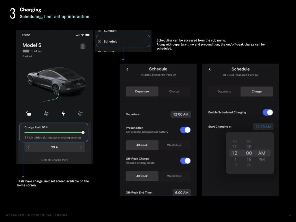
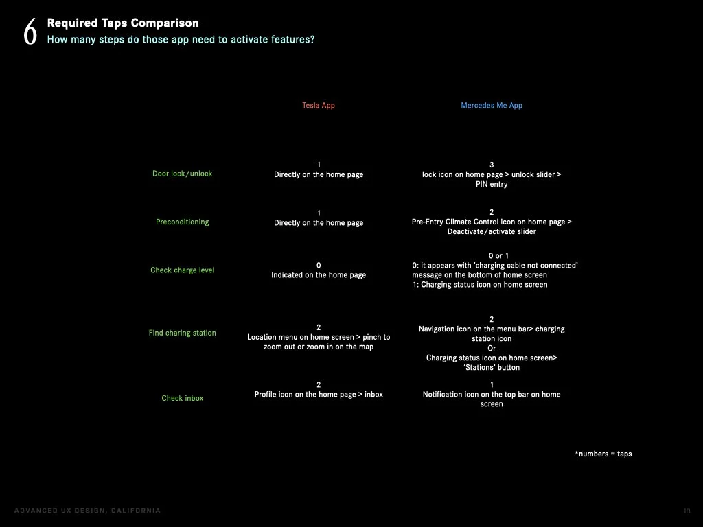
Tesla ss MB app required taps comparison


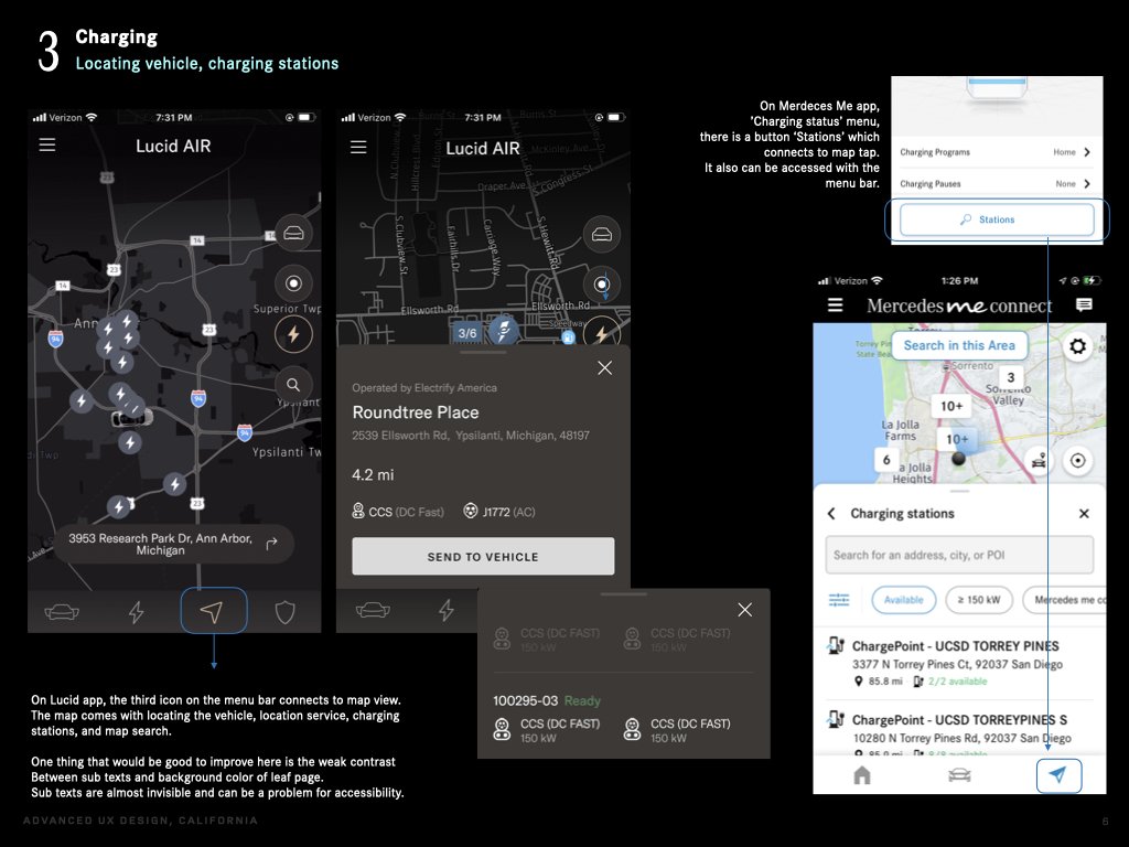
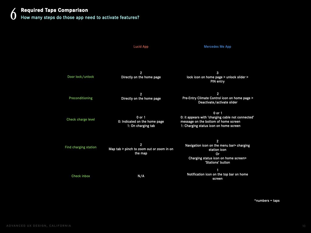
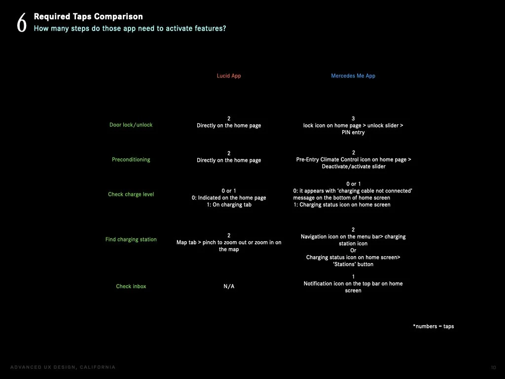
Lucid vs MB app required taps comparison
Main takeaways:
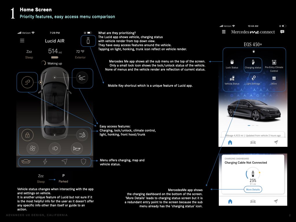
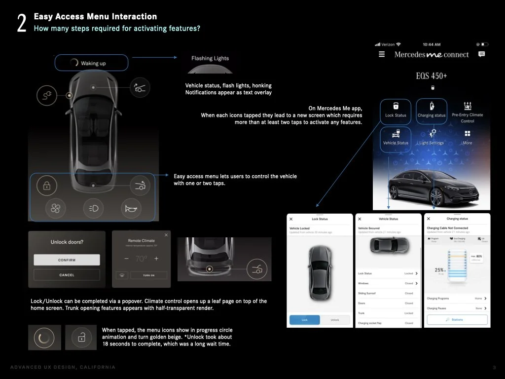
-Easy access menu (quick action menu) can be found on Tesla and Lucid, where as MB app opens up a new screen.
-Vehicle status can be captured at a glance on Tesla and Lucid, where as MB app show limited data or requires multiple steps to find it.
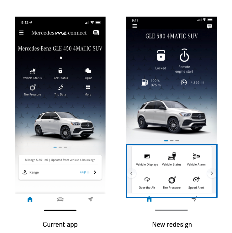
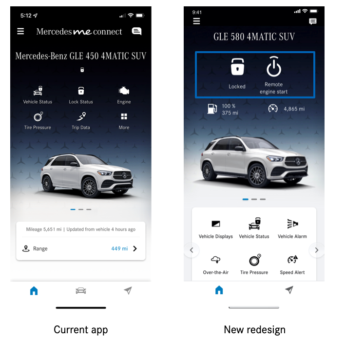
2. Home screen assessment & new design proposal
Based on the findings from the research I focused improving:
- Quick access to vehicle functions
- UI/UX for door lock/unlock, remote engine start features
- Visibility of vehicle status
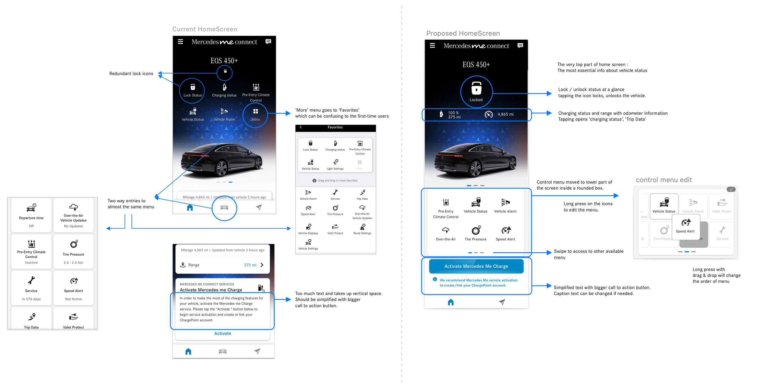
Left side to point out the areas to improve, and right side to propose new design.
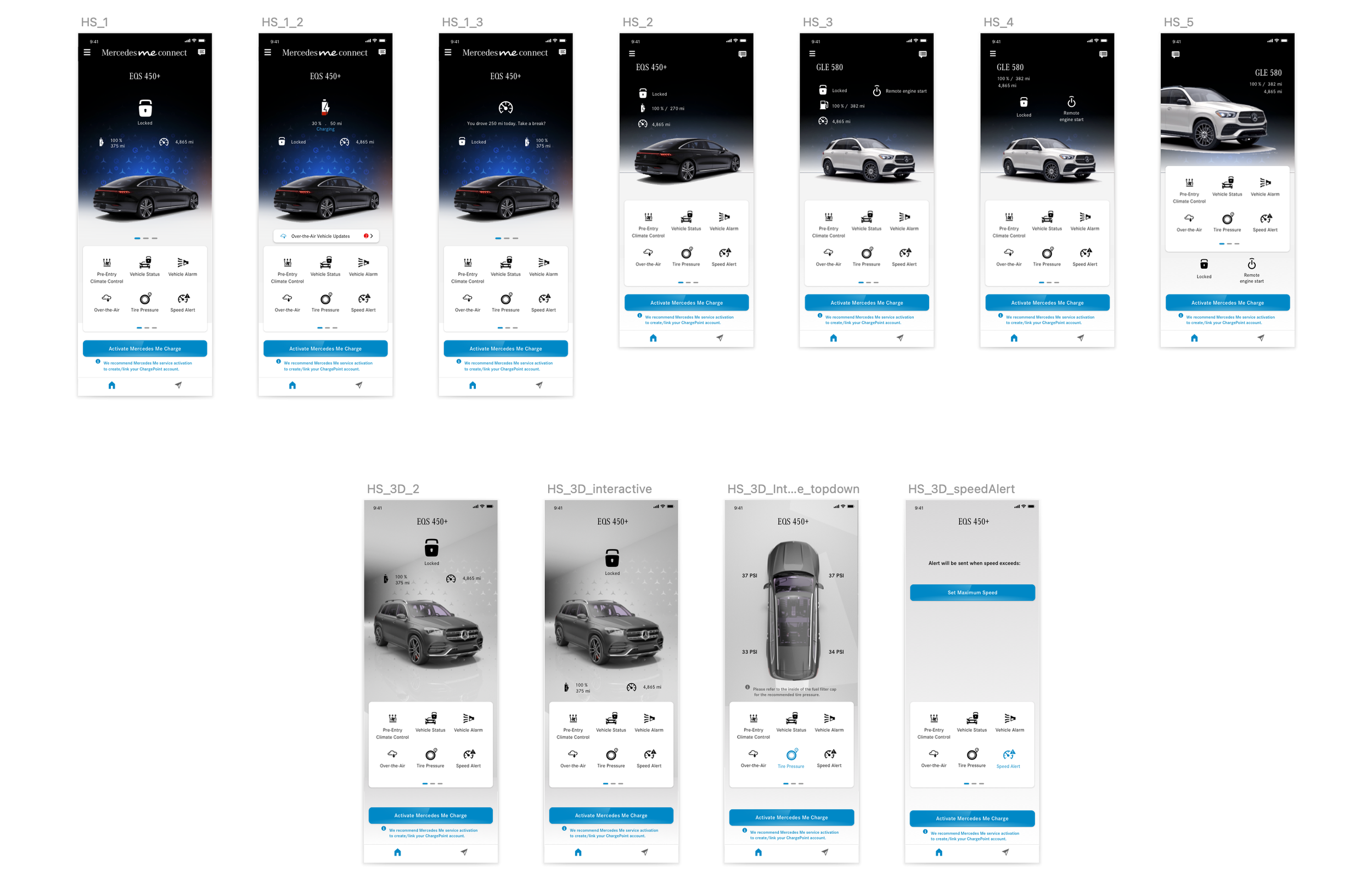
Home Screen Design Exploration
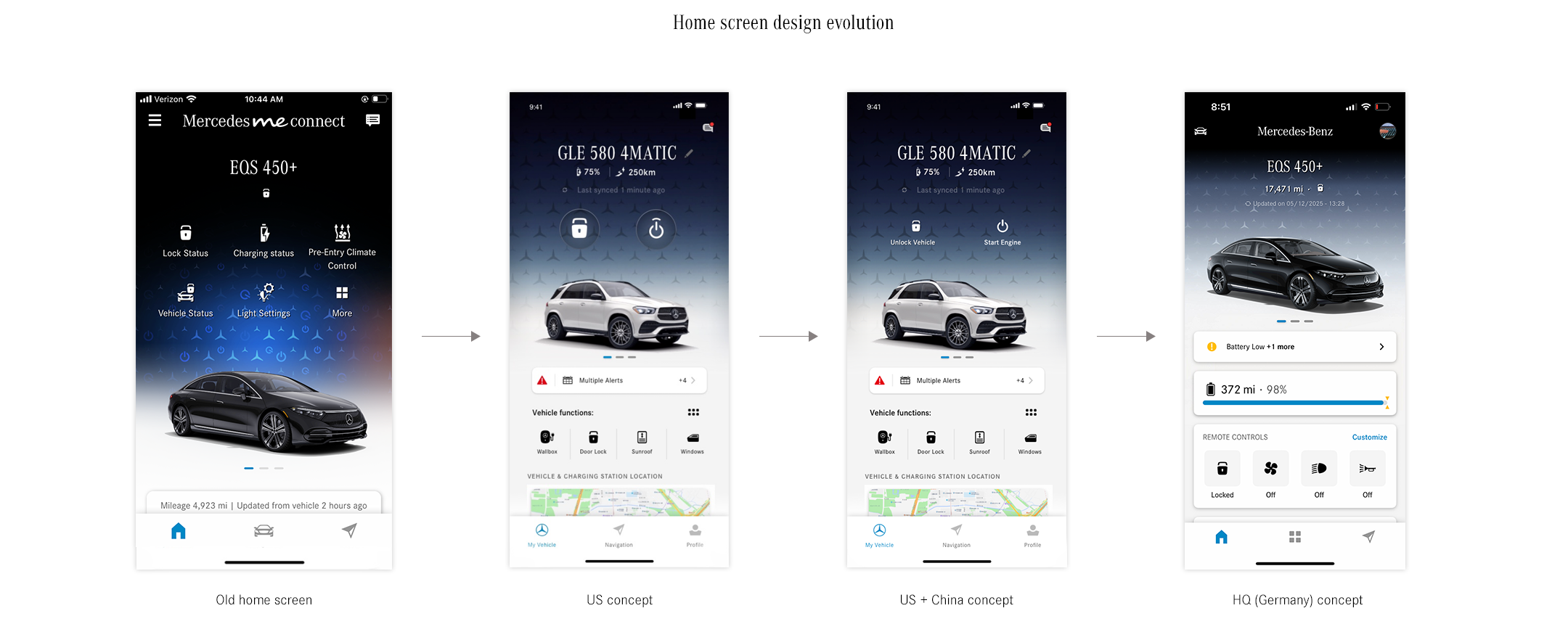
Many different versions for Home Screen design were presented to stakeholders.
Inspired by Tesla’s home screen that shows 3D vehicle renders, I built a scene in Cinema 4D and rendered it as a base of a home screen. The camera angle of vehicle changes depending on the menu selection.

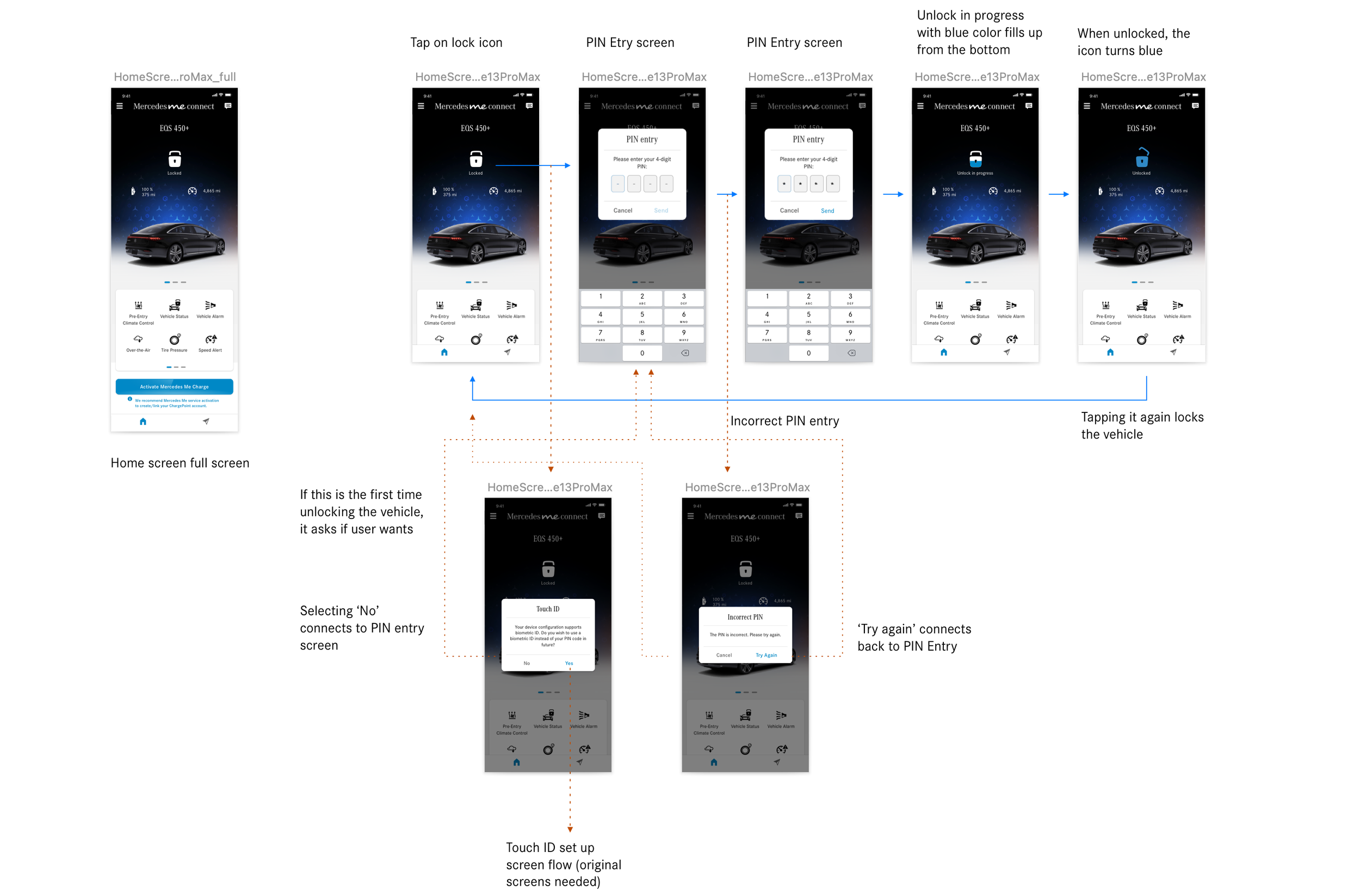
User journey : remote door unlock via quick action menu
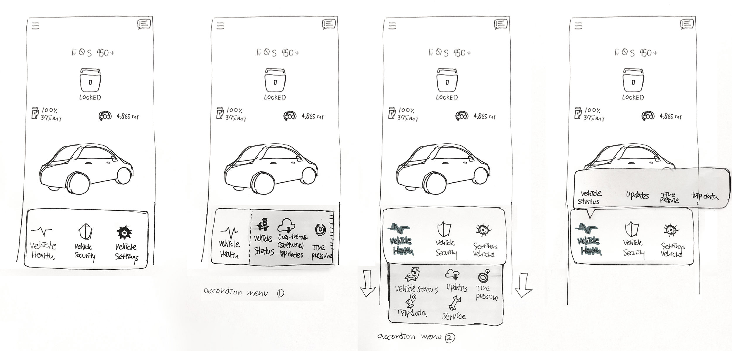
Quick action menu sketch
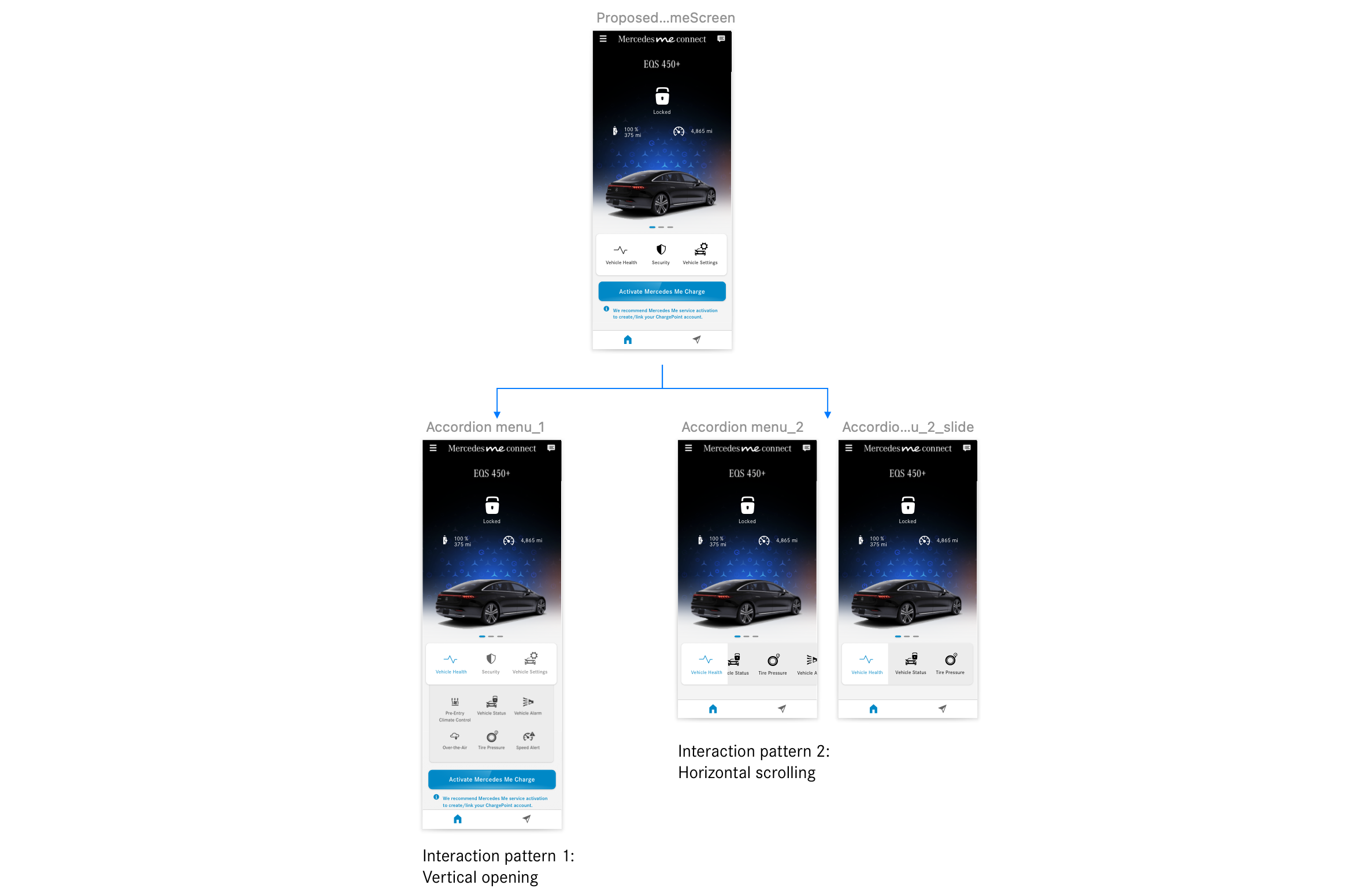
Quick action menu design exploration
Usability Testing
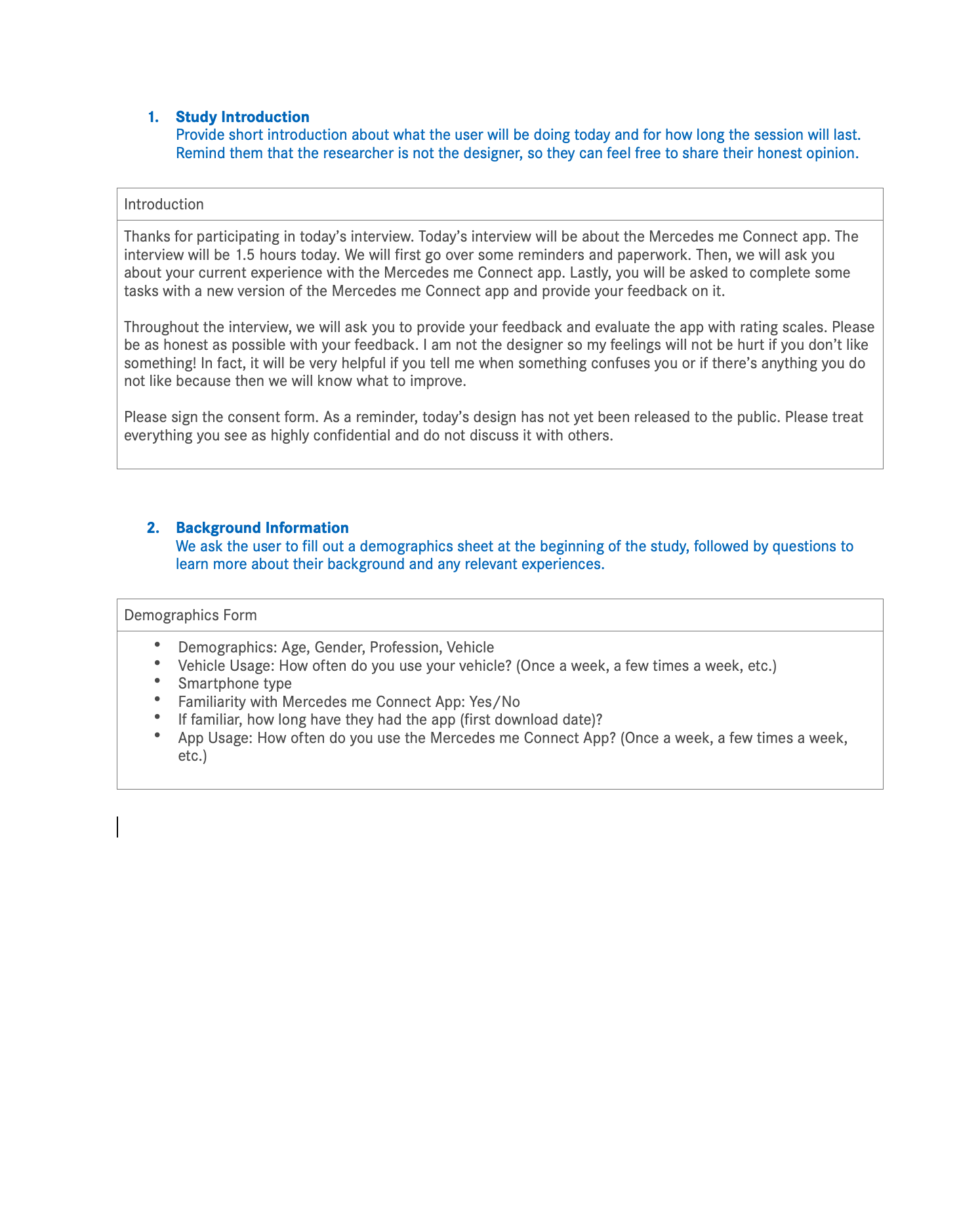
For in-person qualitative research, I worked with internal UX researcher to scope the study, draft the questionnaires, and tasks lists.
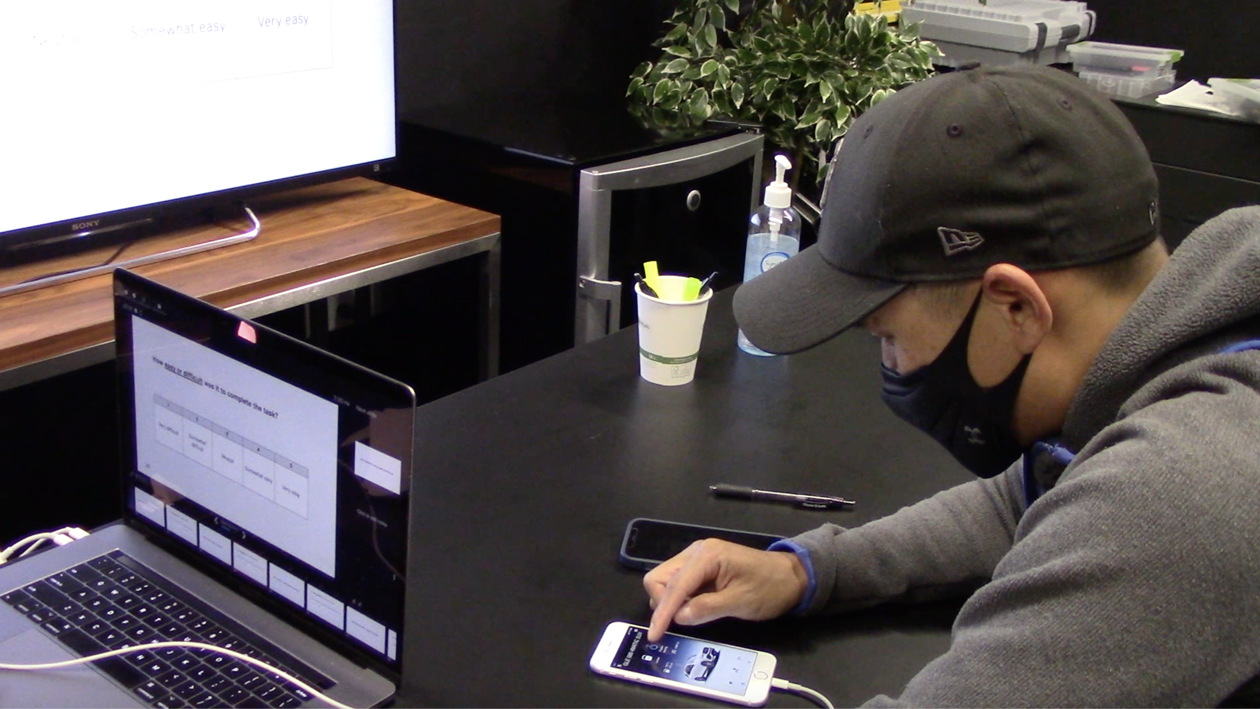
Usability testing session capture
Goal
The goal of the usability testing is to put our prototype to the test. Me and the team wanted to see if our 3 versions of new home screen redesigns provide better and intuitive user experience for our customers. We aimed to gain insights and pain points from the users and to reflect on our prototype for future iterations.
Tools
iPhone loaded with the click dummy prototype of the MyStar app with new home screen proposals (EV, Gasoline Vehicle, 3D version), Video recording device (a laptop), MyStar app home screen printouts, task sheet printouts for testers, timer (mobile), task sheet printouts for observer
Study structure
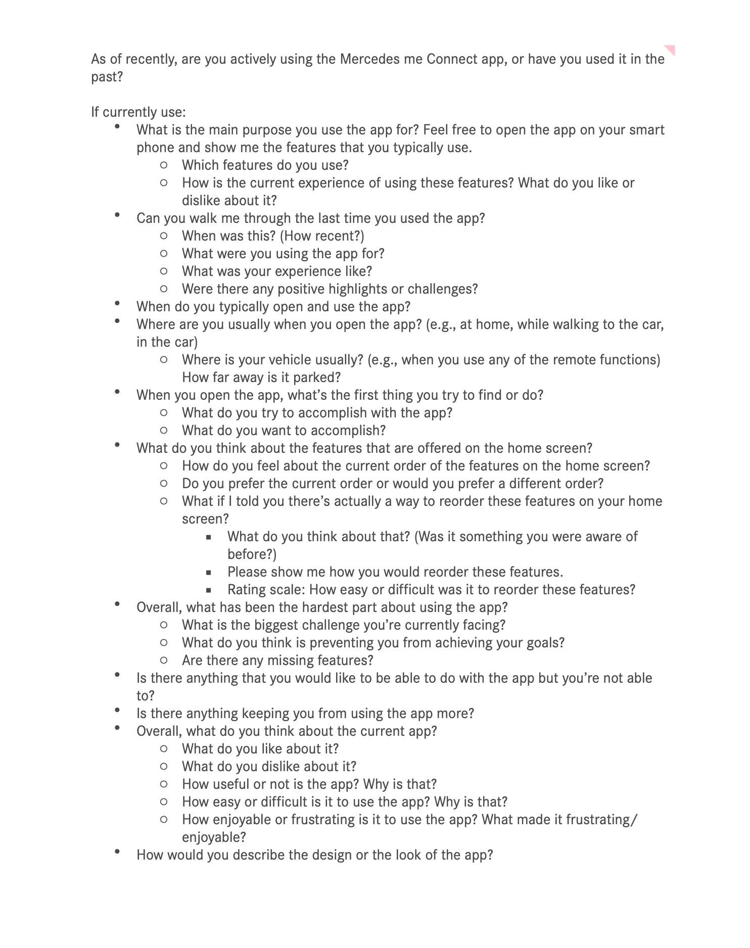
Current app experience questions
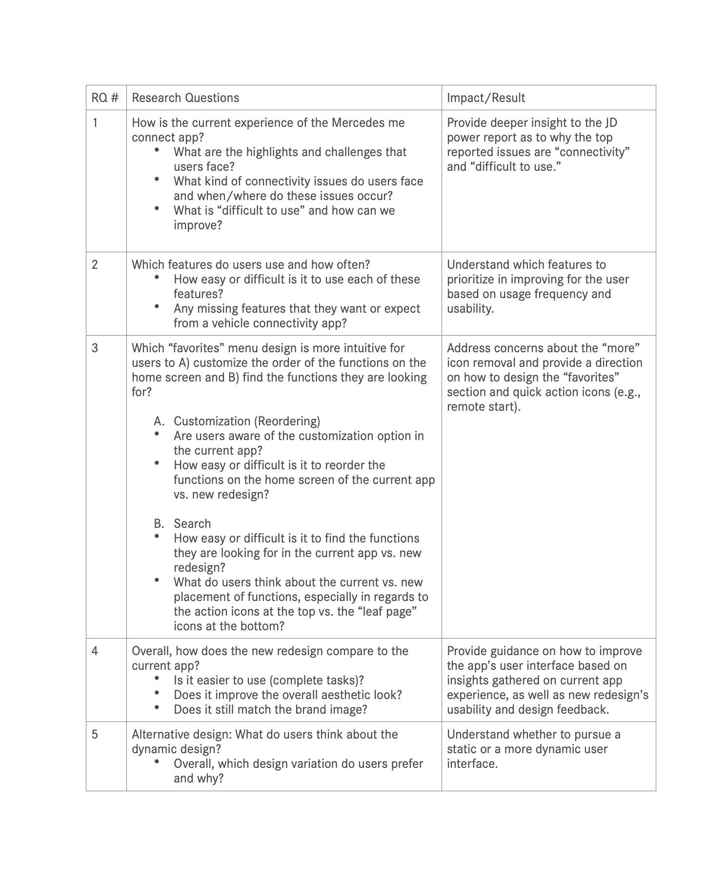
Research questions and their impact and result

Task and questions the users gets to asked with design prototype
Usability Study Results
Q: How easy or difficult is it to find the functions they are looking for in the current app vs. new redesign?
Structure
In comparison to the current app, participants liked the structure of the new redesign because the information they typically look for are easily accessible, such as the lock status and the fuel level.Tapping on “more” page vs. swiping on menu for more functions
In general, participants find it ”very easy” (4.7 out of 5) to find the functions on the “more” page when they do need them. However, they overall prefer the new menu where you swipe to view more functions because it’s easier and more familiar to them.
All participants liked having the quick action buttons at the very top for quick access to the lock and engine functions
Participants like that they can easily check whether their vehicle is locked and if not, they can easily lock it.
One participant likes having the lock at the top, but is unsure of the other features placed at the top, since he does not use them as much.
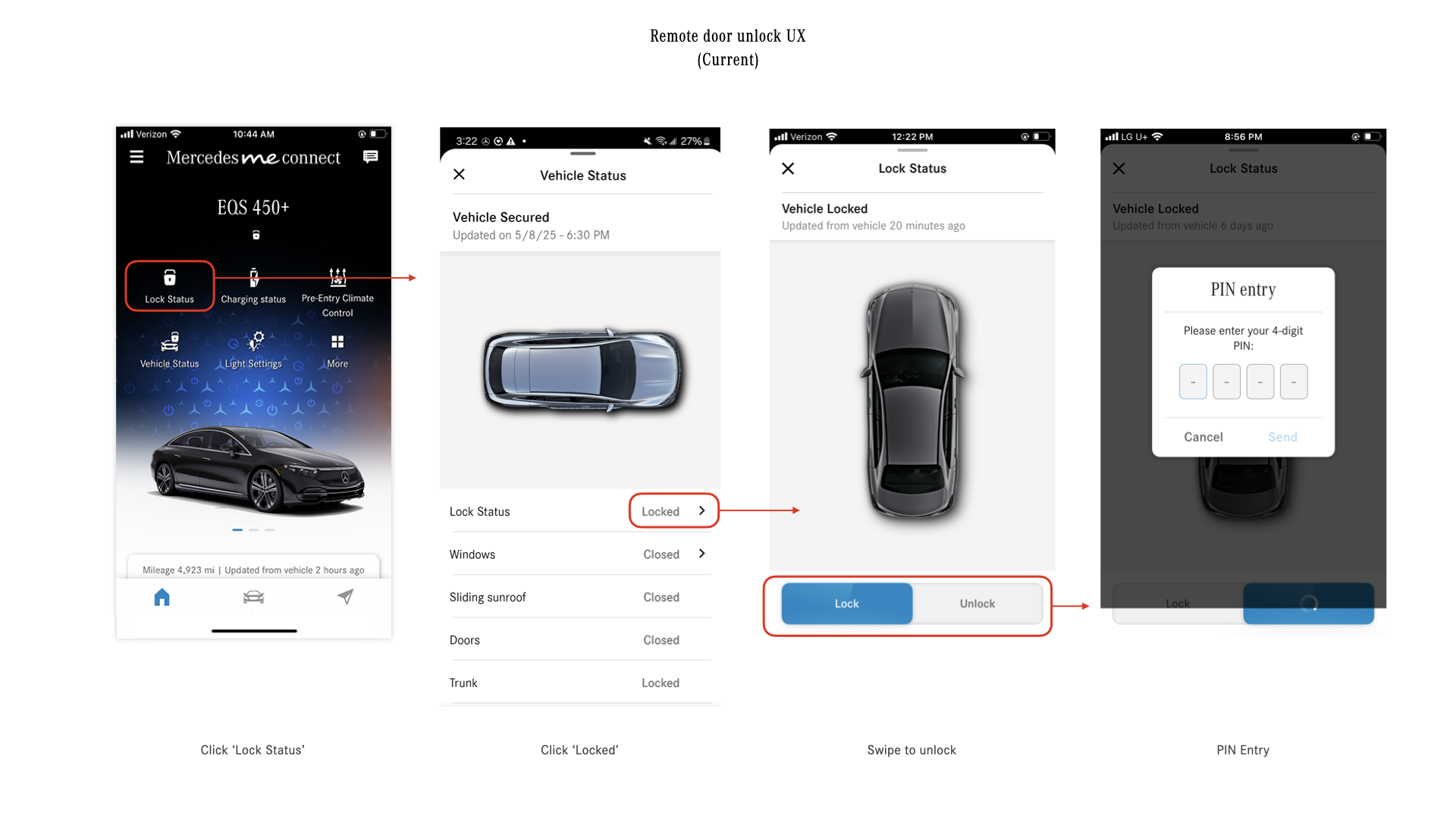
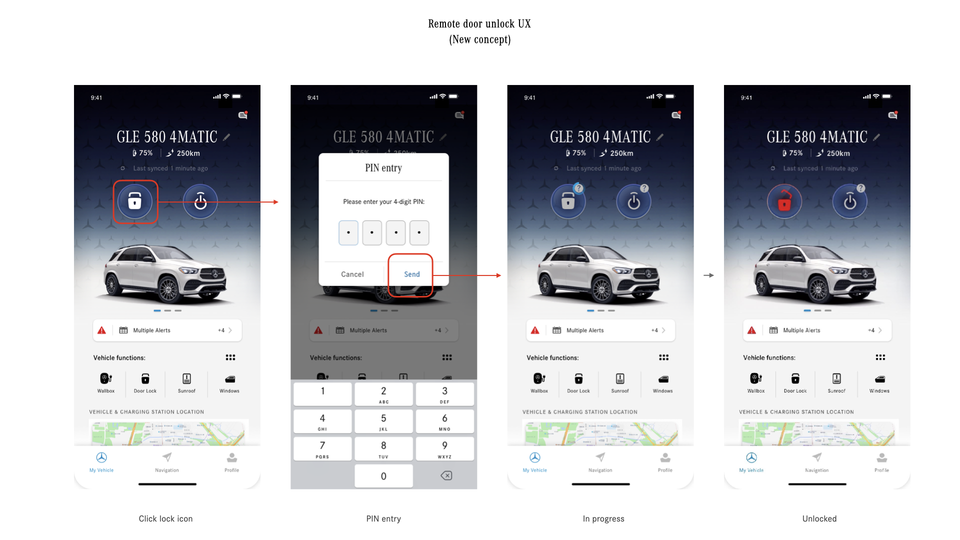
Participants prefer the new version’s way of tapping to lock/unlock doors instead of swiping on the button
A participant earlier in the study had tapped to try locking the vehicle with the current app. With the new redesign, he would have no issue locking the vehicle.
Another participant said, “I prefer the new one. I do not prefer the slide (for unlocking the doors). I’ve always wanted to click the slide.”
Highlights and challenges that users face (Diary study) :
Highlights
Users like the current Mercedes me Connect app because of the accessibility to vehicle information for security and safety purposes.
Users check the app to give them peace of mind that their vehicle is safe to drive (e.g., has enough gas, tire pressure is fine, car is locked and located in the right location).
Some mentioned that the previous apps (Mbrace, Mercedes me) were limited in information, whereas there’s a lot more useful information in the Mercedes me Connect app.
In terms of the UI, users really like seeing their vehicle displayed on the home screen, especially when it matches their vehicle model and color.
Challenges
Users face connectivity issues when in areas with poor reception, which results in slow connection or the app freezing
As a first time user, the registration process was difficult, as they had to go to the dealership. Finding specific functions, such as adding a new user to the account, was also difficult.
In terms of the UI, users find that the color usage is “corporate”-like and would like to see more color to help indicate the status of features (e.g., red if fuel level is below a certain percentage)
What is “difficult to use” and how can we improve?
When users open the app, they want quick access to certain functions. However, it takes one or more steps to find those functions in the current app.
Want to see all important information regarding the vehicle prominently, such as tire pressure and service alerts
Wants the “locate vehicle” function more prominently on the home screen so it’s easier to access
Some functions are not easily discoverable for users
During the study, it was the first time for some users that they discovered and learned about the following functions:
Remote start
Window status
Sending location to vehicle
Locking the doors properly (by sliding the button instead of tapping)
Customization option to reorder functions
Inbox with messages
Users felt positively about these features and would have wanted to know about these features beforehand.
The new redesign addresses some of these issues, such as a tap interaction instead of a slide for the lock function. The placement and sizing of remote start also helps bring awareness to this function.
However, there needs to be a more prominent way to let users know there is a customization option to reorder their functions. Inbox should also include a color bubble to indicate there are new notifications.
Some interactions are difficult to complete for users
Drag and drop to reorder functions
Users expect a shaking animation, similar to an iPhone when you move apps around
Users were not pressing on the function long enough
A user expected to move the function to an empty spot, instead of swapping it with another function
A user did not know that you could drag functions from the top to bottom section of the “more” page
Sliding the button to lock or unlock the vehicle
A participant thought he had locked his doors by only tapping on the lock button
After trying out the new version, a participant said they always wanted to tap the slide button and would prefer the new version’s way of tapping to lock the vehicle
What happened next?
Since the home screen design is a core part of the app that affects other global markets’ MB apps, all the other design teams in Germany and China put efforts in redesign project. Soon after my design proposal was shared with the teams, they also started coming up their own ideas.
There are countless versions of designs emerged and developed from those key 3 design teams, cross-referencing each other’s versions.
Eventually, the last design iteration is developed by design colleagues in Germany. Considering U.S team had less resources comparing to the other design teams, it was inevitable to adapt the other team’s work.
Lessons Learned
Involve stakeholders early
Even though my rational for redesign is referencing the data from user studies and reports, the initial reaction from the stakeholders in Germany was surprisingly negative. I faced lots of push backs which was one of the difficult moments in my career. Looking back, the reason could be that the design initiative was not well communicated in the beginning.
Learn the process quickly :
From their perspective, the new design was a surprise that came out of blue that they need to approve, by getting signed off by their stakeholders in HQ. Since freshly joined the app project, I wasn’t familiar with their design approval process which made the German stakeholders difficult to understand the U.S. triggered redesign effort. I learned that no matter how ‘important’ the design concept it is, it was critical to include the stakeholders in the early conversation. That way, both parties can understand thinking process and build healthy working relationship.Establish consistent communication :
After that, regular sync sessions for design review was established between me and stakeholders in Germany. Gradually, both parties were able to have better communication and support system.
I don’t have to do everything.
Focus on the importance of teamwork and purpose of design :
Feeling of defeat (?) was initial reaction to the decision but soon I realized there are no winning and losing when working as a team.
The ultimate goal as a designer is to deliver products that serve users better.
I don’t have to be the one who created the exact quick action buttons or icons.Learn how to inspire others, hence lead the change. :
I was happy when realized I was the initial spark that made a big change as well as all the iteration process that help the product evolve.
And that, also, in some ways, a baby step to be a great leader in the long run.
Impact
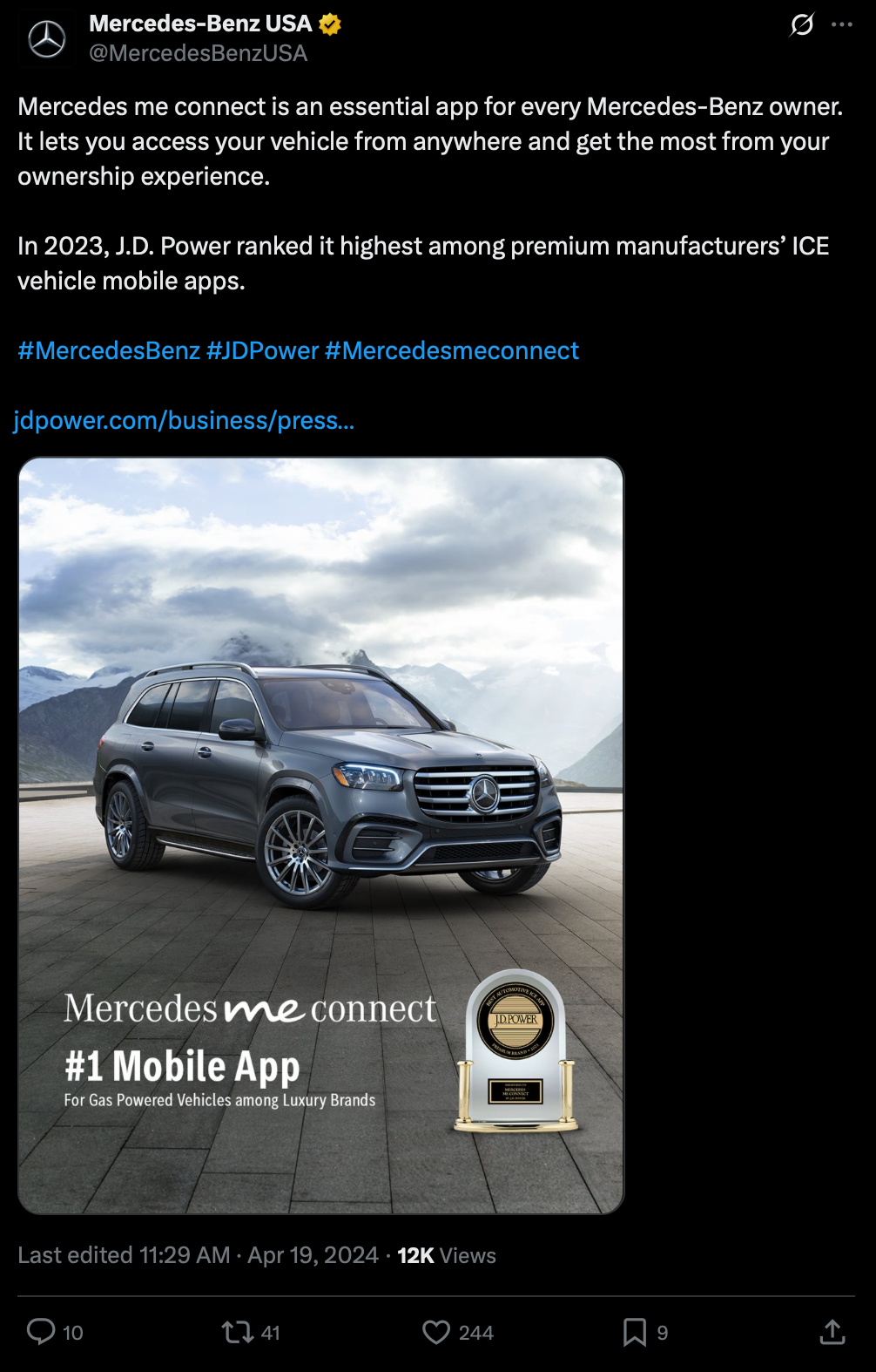
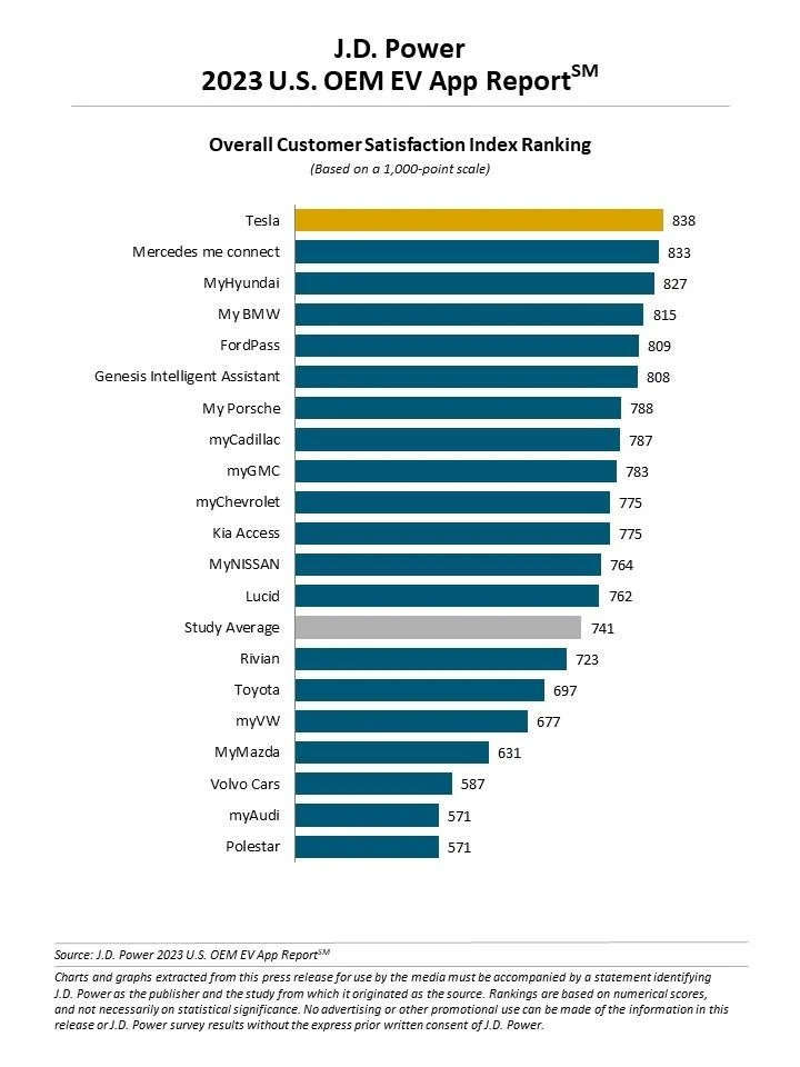
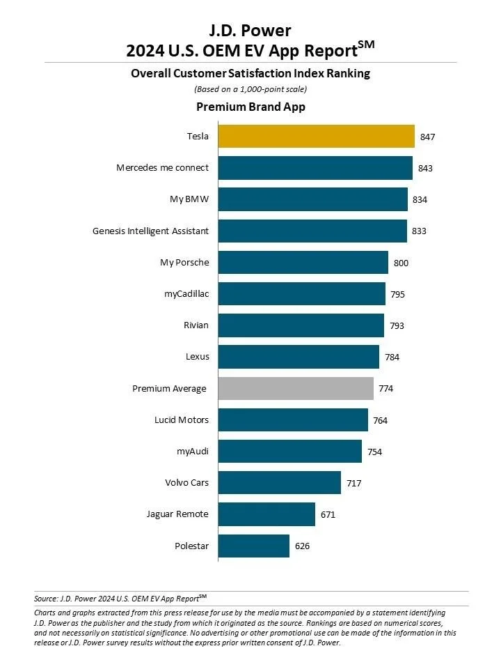
2023, 2024 - #2 ranking in J.D. Power’s Best Overall OEM EV App report
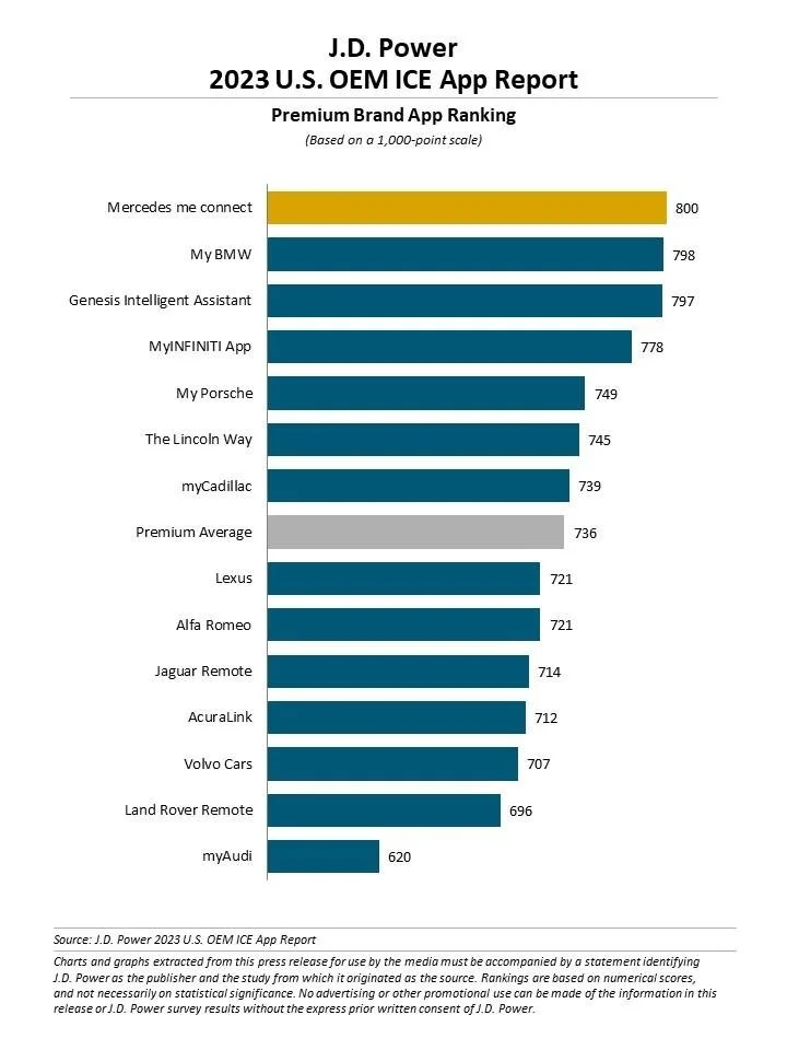
2023 - #1 ranking in J.D. Power’s premium OEM ICE vehicle App report